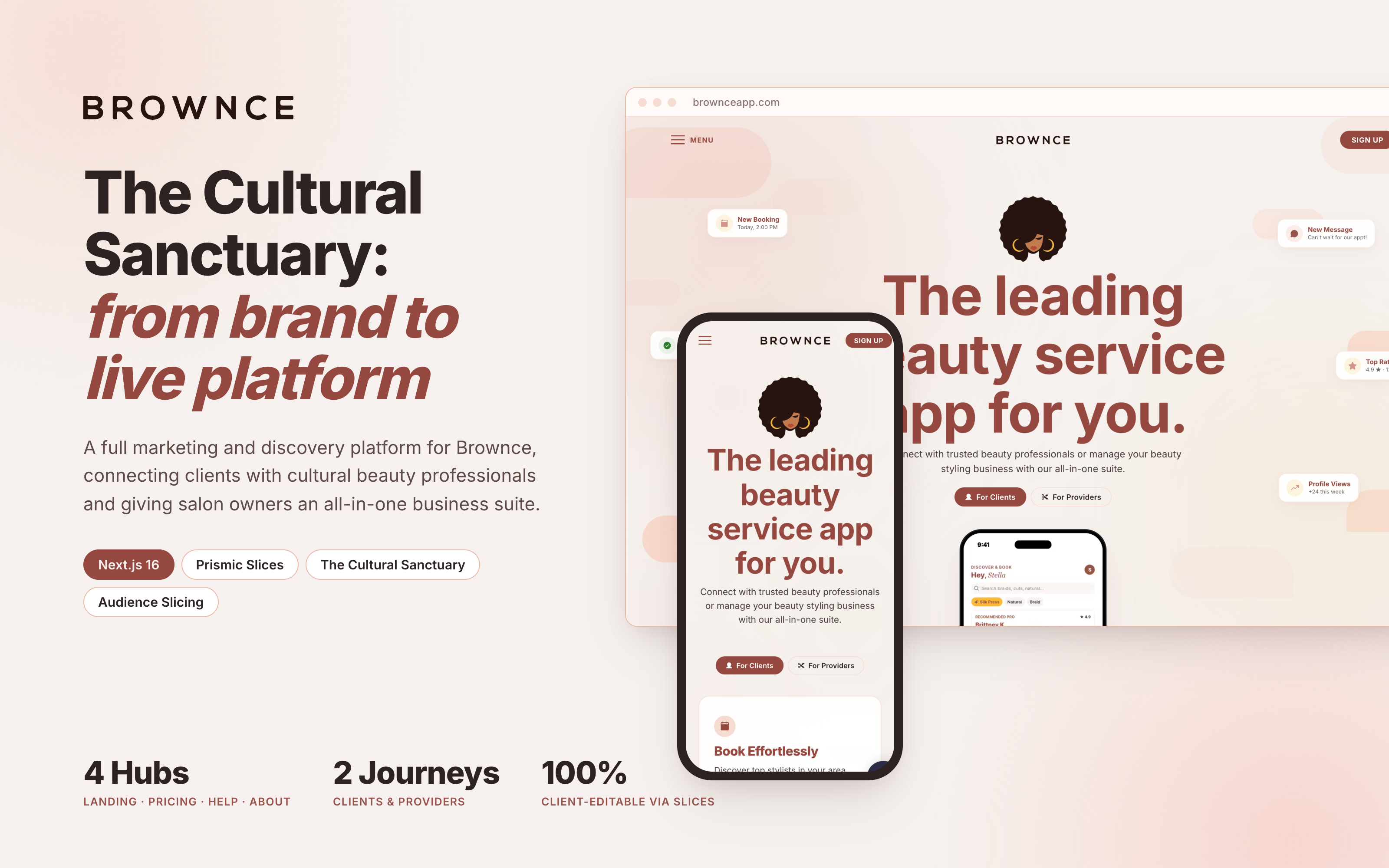
Challenge
Cultural beauty is built on intimacy and trust. For Black and brown clients, booking a braider, loctician, or natural hair specialist isn't just a transactional appointment—it's an investment of hours, money, and personal care. Finding skilled professionals has historically meant relying on word of mouth, fragmented Instagram feeds, and awkward direct messages with unclear pricing and no deposit protection.
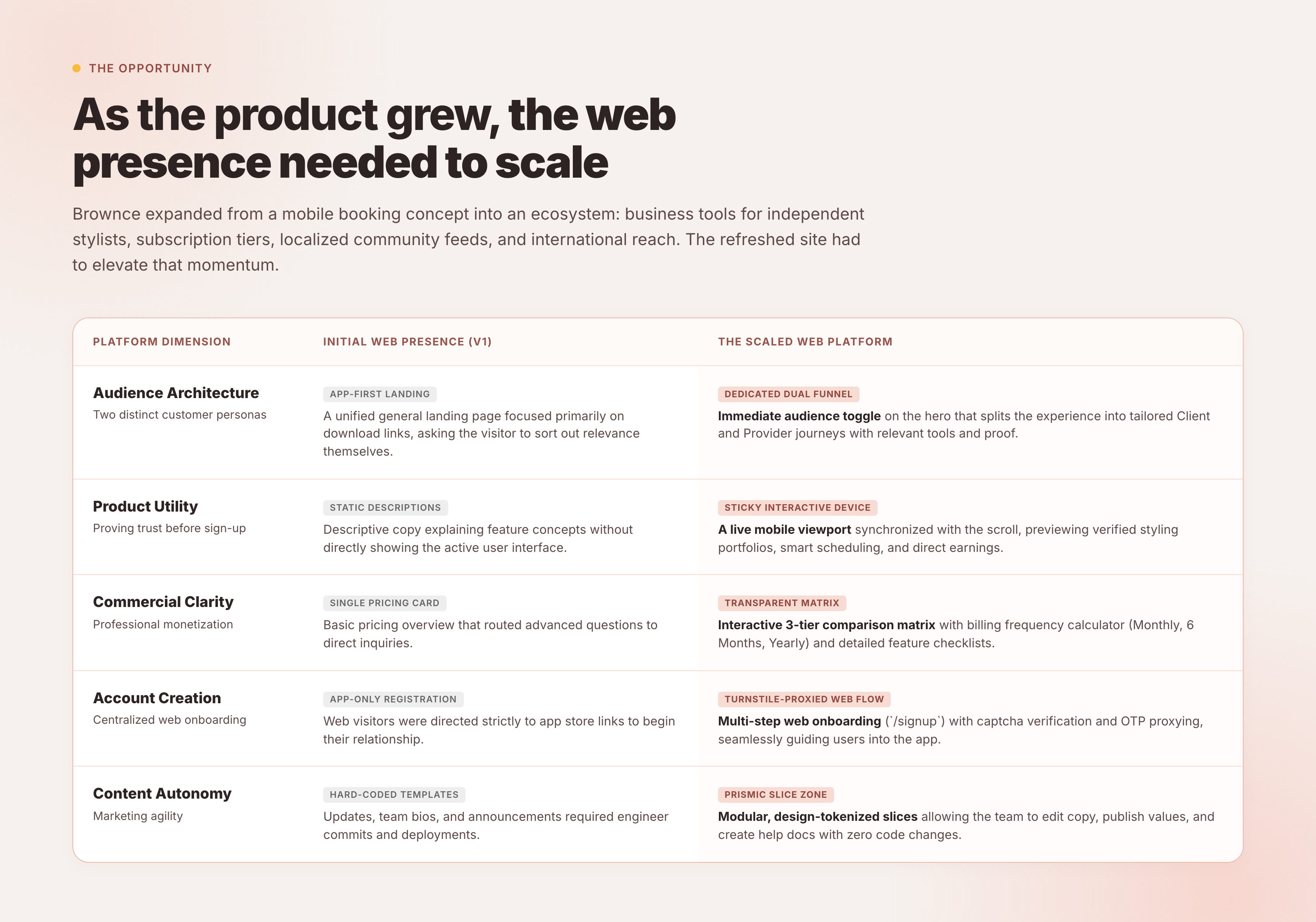
Brownce set out to bridge this gap. Having designed the original v1 launch site for Brownce, I had helped establish the brand's initial digital footprint when it was a lean, mobile-first concept. But as the company matured, its ecosystem grew substantially. Brownce wasn't just a directory anymore: it had introduced dedicated provider business tools (treatment logs, automated scheduling, deposit rules), tiered subscription plans for salon owners, a community discussion hub called ShopTalk, and expanding operations across major cultural centers.
 Inspect Detail
The original site had served its initial purpose well, but it could no longer keep pace with this expanded scope:
- Two distinct audiences on one front door. Beauty clients wanted to see styling portfolios, verified reviews, and effortless booking. Beauty professionals wanted to understand business software: calendar sync, deposit guarantees, and fee structures. Cramming both into a single linear page risked alienating both.
- Developer dependency for marketing. The early site had hardcoded copy and assets. Every new promotion, tier update, or FAQ adjustment required a developer pull request, creating friction for the founding team.
- Showcasing the product truthfully. Marketing pages often rely on generic device mockups with placeholder screens. Brownce needed to prove that its mobile booking and business management software was real, polished, and ready to use.
The Bet
A cultural sanctuary on the web. Rather than building a cold, transactional marketplace or a generic B2B SaaS page, the web platform needed to feel warm, grounded, and dignified—honoring the craft of cultural beauty while projecting institutional credibility.
Three core architecture bets guided the design and engineering:
- Audience slicing at the root. Segment visitors immediately in the hero fold with an instant toggle, tailoring the entire narrative for clients or providers without fragmenting into separate confusing domains.
- Scroll-synchronized device choreography. Pin a live mobile viewport in the center of the screen that cross-fades verified application interfaces as the visitor scrolls through each feature milestone.
- Total slice-based autonomy. Treat the content management system as a product in itself, giving the Brownce team complete visual modularity in Prismic without touching a line of code.
Process
Audience Slicing: One Canvas, Two Journeys
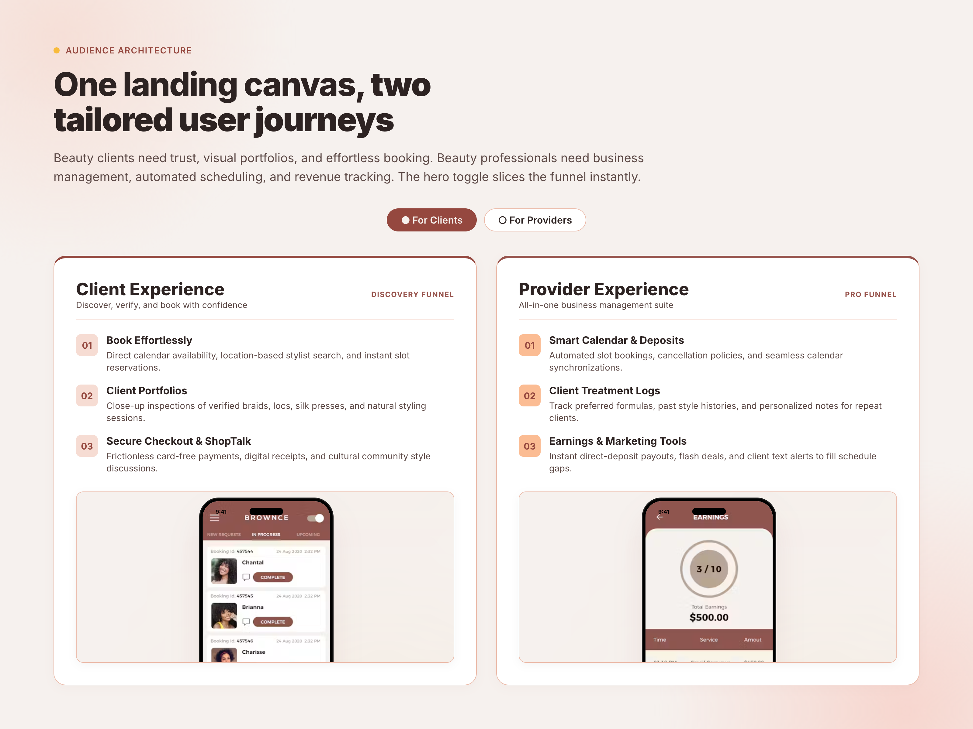
The foundational design challenge was resolving the dual-audience tension. A client evaluating an appointment doesn't care about cancellation fees or direct-deposit merchant accounts. A stylist looking for business software isn't looking for a braid inspiration gallery.
 Inspect Detail
Instead of forcing users through separate subdomains or disjointed landing pages, I designed a fluid audience toggle at the top of the canvas:
- The Client Experience: Emphasizes verified stylist portfolios, transparent upfront pricing, direct calendar booking, and protected card-free checkout. Secondary callouts highlight ShopTalk, where clients can ask questions and discuss styling routines with the community.
- The Provider Experience: Re-orients the pitch around business sustainability. Highlights include smart calendar scheduling that blocks out prep time, client treatment history cards that record past color formulas and parting patterns, and automated payout tracking.
Toggling between modes smoothly swaps out the value propositions, feature descriptions, and visual evidence, allowing one URL to serve both high-intent discovery and professional recruitment.
Choreographing the Scroll: Fixed Phone Viewport
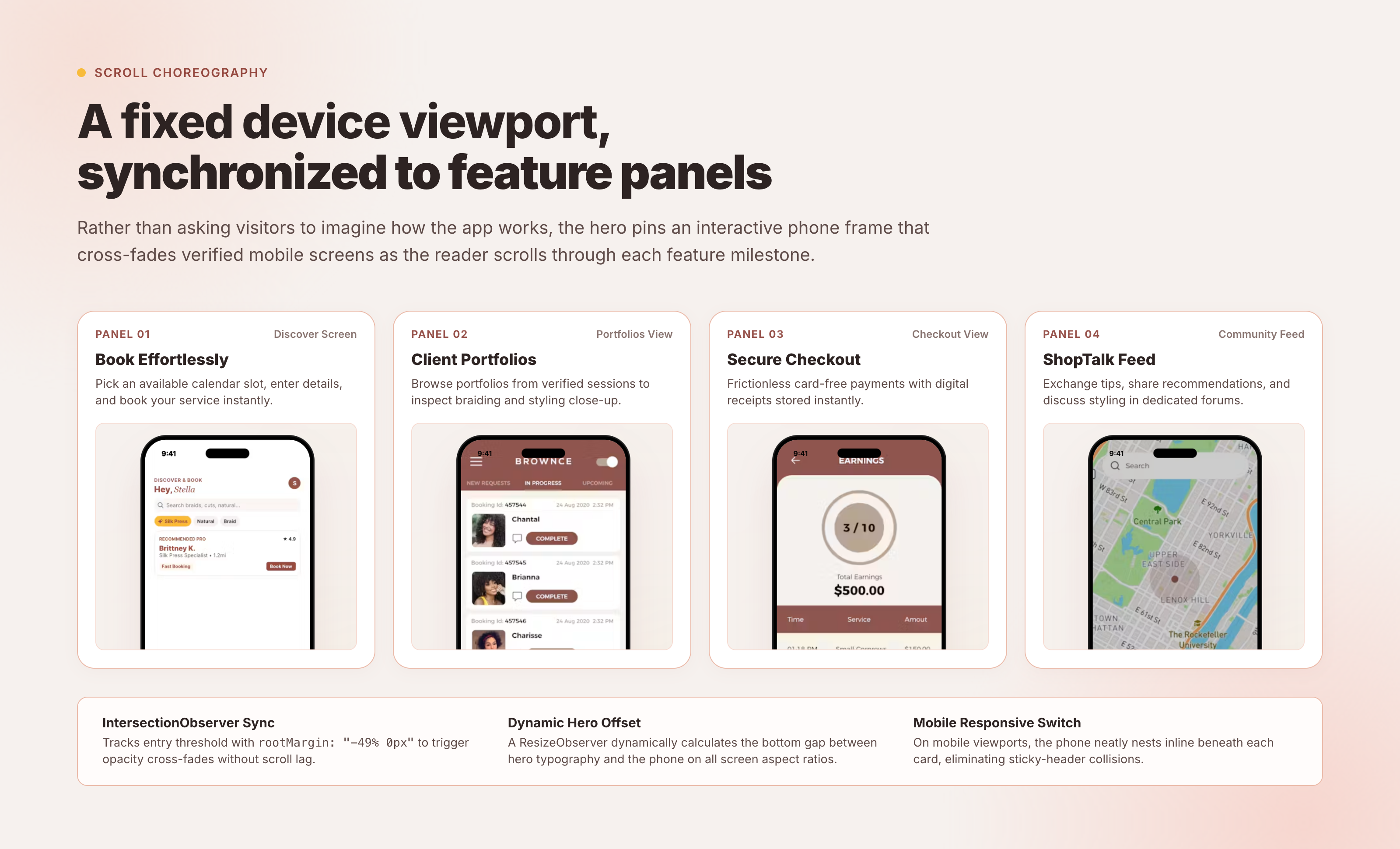
Visitors rarely read long lists of software features. To communicate the speed and tactile feel of the Brownce mobile app, I engineered an interactive scroll-story module that anchors the landing page.
 Inspect Detail
As the reader scrolls down the page, a high-fidelity mobile device frame stays pinned in view. Four sequential feature milestones scroll past on the left:
- Book Effortlessly: Real calendar slots, service selection, and instant reservation confirmation.
- Client Portfolios: Verified close-up photography of braids, locs, silk presses, and natural cuts.
- Secure Checkout: Frictionless digital payments with instant receipts.
- ShopTalk Feed: Community threads, care tips, and peer stylist recommendations.
To build this without jank or scroll-jacking, I used native CSS sticky positioning combined with an IntersectionObserver configured with rootMargin: "-49% 0px". When a panel crosses the vertical midpoint, the active index updates and cross-fades the corresponding mobile UI screen using GPU-accelerated opacity transitions. On narrow mobile viewports, the sticky layout automatically untethers and nests the device preview inline beneath each card, preventing sticky-header collisions.
The Cultural Sanctuary Design System
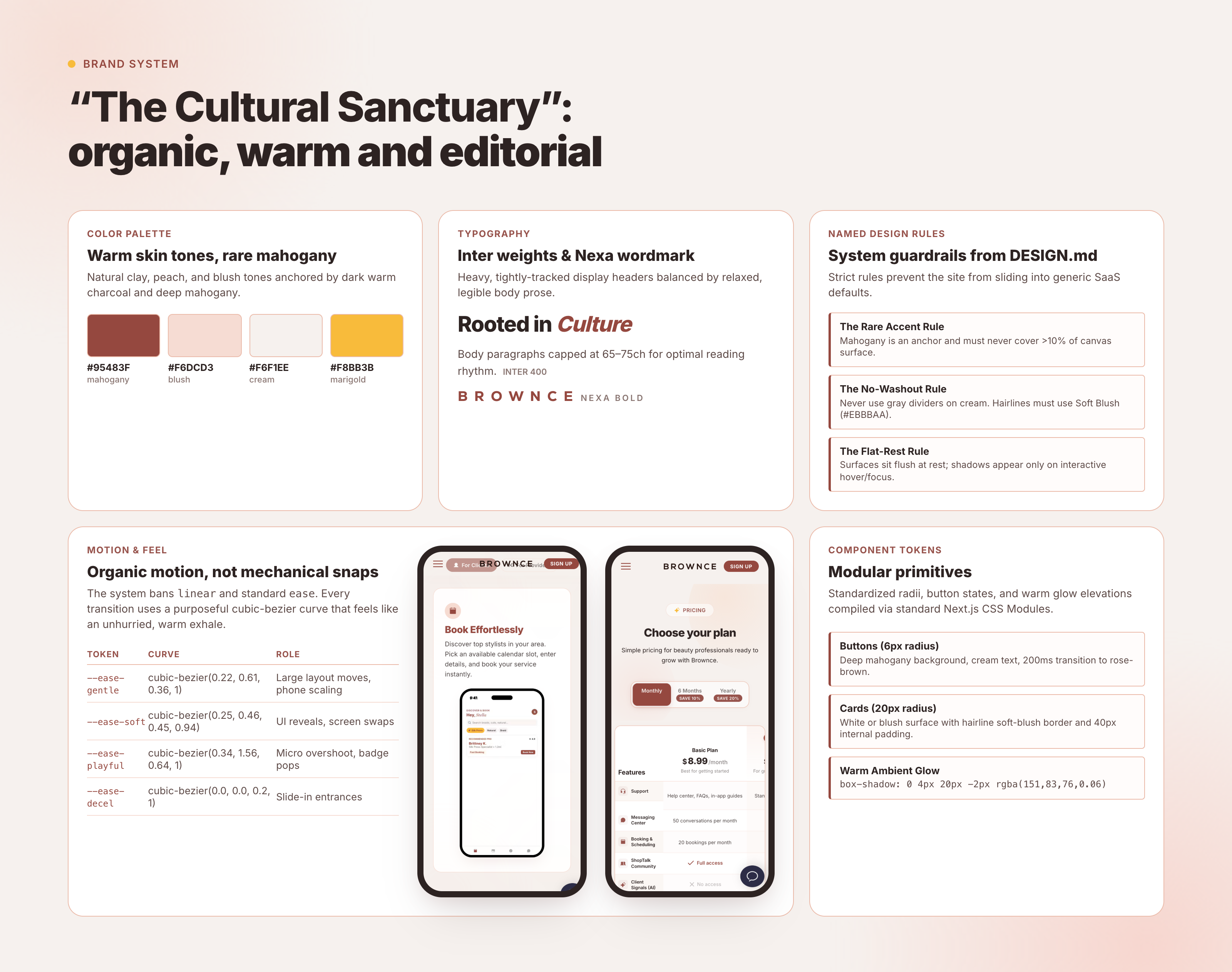
Brownce's visual identity celebrates the beauty traditions of the African diaspora. The design system, coined The Cultural Sanctuary, translates those cultural roots into a refined, high-end digital token vocabulary.
 Inspect Detail
Every design token was calibrated to avoid the generic "startup look":
- Palette: A warm cream canvas (
#F6F1EE) replaces harsh stark white. Ink typography uses deep warm charcoal (#2D2322) rather than pure black, reducing visual fatigue. Hairlines and subtle borders use soft blush (#EBBBAA), never cool corporate grays. Deep mahogany (#95483F) is reserved for primary interactive buttons and key accents, used with restraint (under 10% of any screen surface). Warm marigold (#F8BB3B) serves as an amber touchpoint. - Atmospheric Depth: Instead of heavy drop shadows or flashy animated meshes, the canvas uses diffuse radial fields of blush and peach positioned along structural diagonals. These ambient washes add tactile warmth without hurting text contrast.
- Typography: Inter is utilized across all UI, navigation, and body copy for crisp legibility across viewports. The geometric wordmark typeface Nexa is reserved strictly for brand mark moments.
- Component Anatomy: 20px rounded cards create friendly, approachable containers, while buttons use crisp 6px radii and uppercase 700-weight typography for clear call-to-action hierarchy.
Modular Content Engine: Prismic Slices
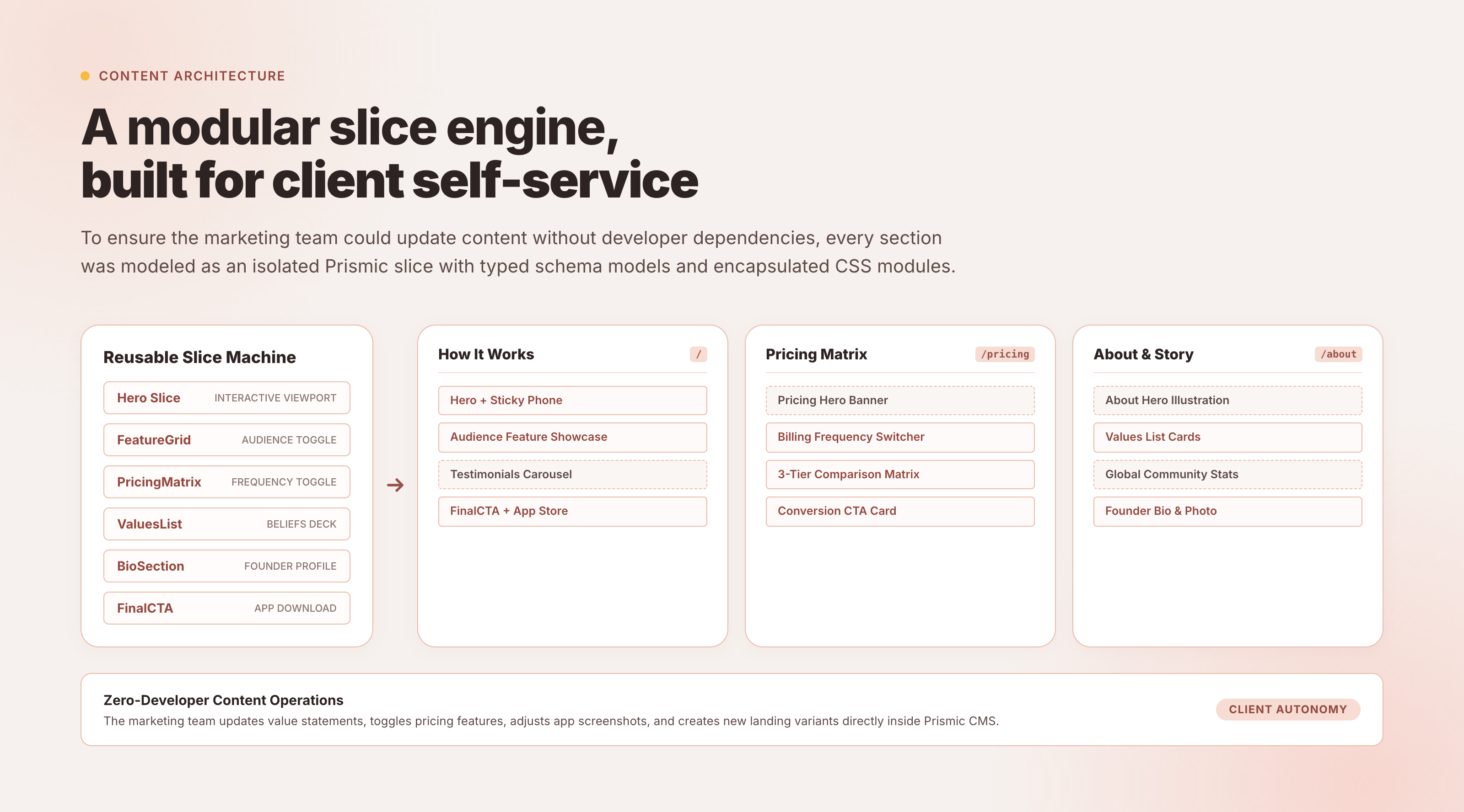
A redesign only stays successful if the client can maintain it. Rather than building static templates that would decay as marketing priorities shifted, I built the platform around Prismic Slice Machine.
 Inspect Detail
Every section on the site was engineered as an autonomous, self-contained slice:
- Hero Slice: Configurable headlines, eyebrow pills, audience toggle switches, and background graphic toggles.
- Scroll Story Slice: Dynamic feature panel repeaters with synchronized device image slots.
- Comparison & Tier Slices: Configurable pricing columns, fee percentage indicators, and feature checklist items.
- FAQ Accordion Slice: Expandable Q&A accordions with category grouping.
- Download Banner Slice: Dynamic App Store and Google Play badges with device illustration options.
Each slice is backed by strict TypeScript interfaces and modular CSS, ensuring that no matter how the client team stacks, reorders, or updates sections, the visual hierarchy and spacing tokens remain unbreakable.
Zero-Trust Web Onboarding: Cloudflare Turnstile & API Proxy
While Brownce's core transactions occur within the mobile application, web onboarding plays a crucial role in converting visitors from social campaigns and marketing channels into registered users.
 Inspect Detail
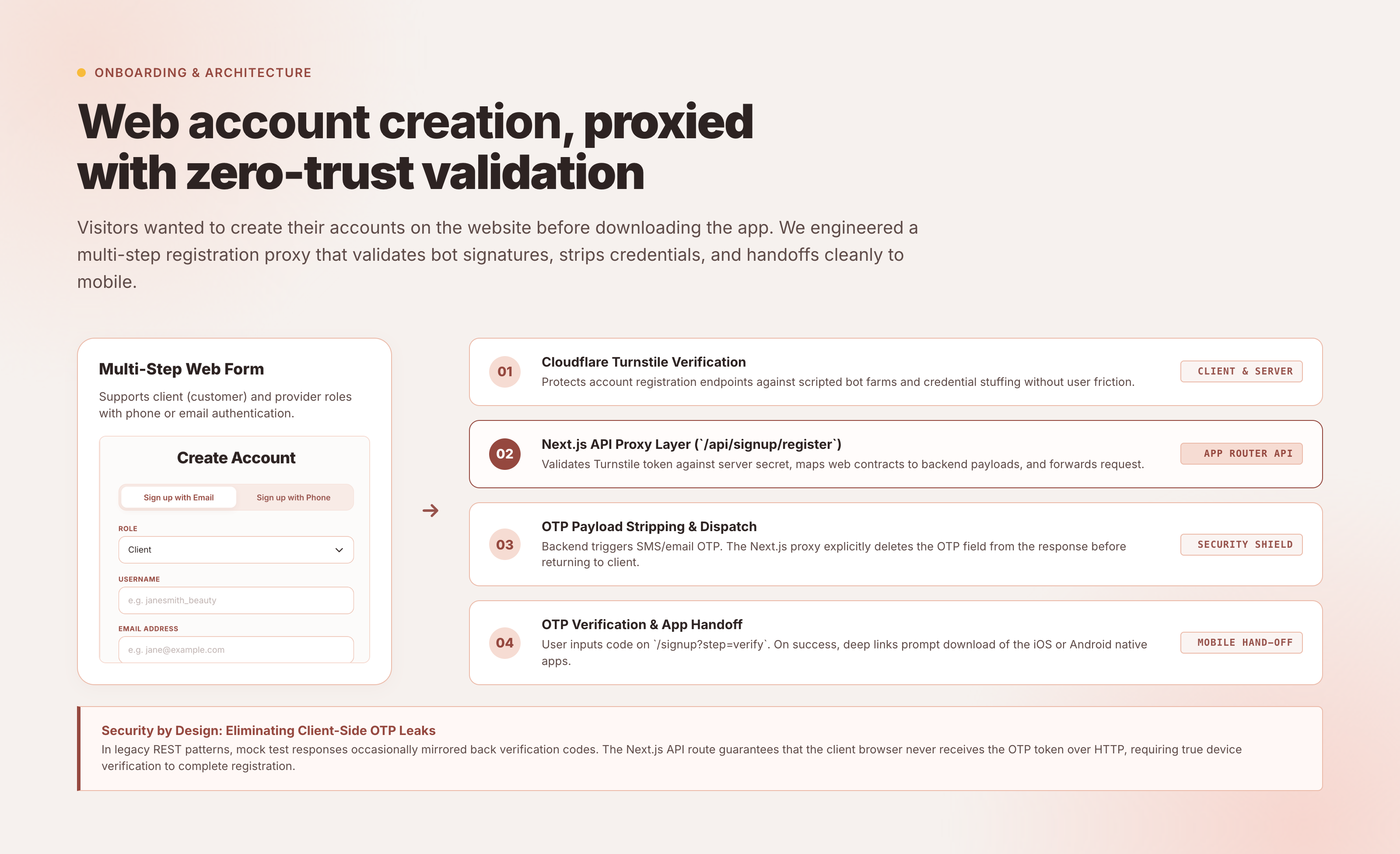
Onboarding uses phone-number-based one-time password (OTP) verification. Exposing SMS verification endpoints on the public web creates significant risks of bot abuse, toll fraud (SMS pumping), and server flooding.
To secure this funnel without punishing real users with annoying image-matching puzzles, I implemented a zero-trust verification pipeline:
- Cloudflare Turnstile: An invisible client-side challenge verifies human intent without interrupting the user.
- Server-Side API Proxy: The Next.js backend intercepts the submission, verifies the Turnstile token directly with Cloudflare, applies rate-limiting rules, and only then forwards the phone payload to Brownce's upstream authentication microservice.
- Direct App Handoff: Once verified, users receive deep links directing them directly into the iOS or Android app to complete their salon profile or book their first appointment.
Commercial Clarity: Tiered Pricing & Help Center
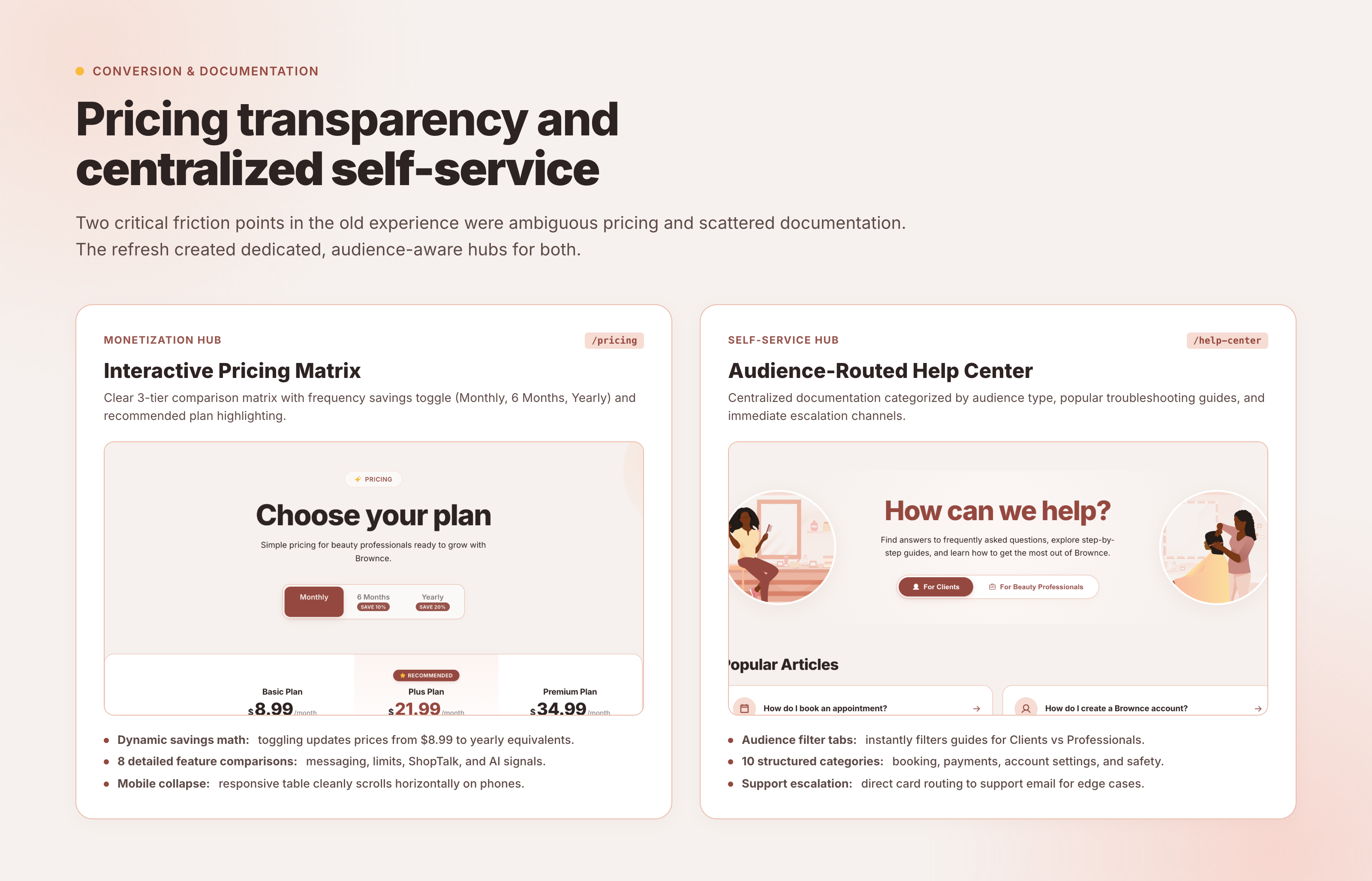
To establish Brownce as a complete platform, the refresh extended well beyond the homepage into dedicated commercial and support destinations.
 Inspect Detail
- Tiered Provider Pricing (
/pricing): Detailed breakdown comparing the Free, Bronze, and Gold provider subscription plans. The interface clearly lays out commission rates, booking deposit protections, marketing tools, and multi-stylist salon management features so stylists can make informed business decisions. - Searchable Help Center (
/help-center): Structured documentation addressing common questions from both clients (booking policies, cancellations, payment safety) and providers (payout schedules, account verification, salon blueprinting). - Brand Story (
/about): Dedicated narrative space honoring cultural representation, economic empowerment for Black and brown beauty entrepreneurs, and the history behind Brownce's founding.
Impact
| Deliverable / Architecture | Shipped Result |
|---|---|
| Platform Footprint | Complete brand-to-web refresh across 4 core hubs: Landing, Pricing, Help Center, and About. |
| Audience Architecture | Instant dual-audience toggle (Clients vs Providers) on a single unified canvas. |
| Scroll Viewport Engine | GPU-accelerated sticky mobile device viewport with IntersectionObserver screen cross-fades. |
| Design System | The Cultural Sanctuary design system: 14 color tokens, hairlines, and typography hierarchy. |
| CMS Autonomy | 100% slice-based Prismic architecture; zero developer intervention required for copy or campaigns. |
| Security Posture | Cloudflare Turnstile invisible verification + Next.js server-side OTP proxy against SMS fraud. |
| Mobile Handoff | Deep-linked App Store and Google Play routing for both clients and beauty professionals. |
| Role | Freelance Product Designer & Design Engineer (Sole designer and engineer for the web platform). |
Reflection
Designing v2 is about opportunity, not critique. Having designed the original v1 site, it was rewarding to see how far Brownce had evolved. Early-stage websites are meant to test hypotheses and establish a presence; scaling websites need to support operations, business tiers, and distinct customer segments. Approaching the redesign as an expansion of capability—rather than a critique of past work—kept the focus on unlocking growth.
The CMS is a first-class product. The quality of a client website is only as resilient as the authoring experience behind it. If making a copy change requires opening code or navigating fragile templates, the site inevitably stagnates. Investing the upfront engineering time to model thoughtful Prismic slices gave the Brownce team full creative sovereignty.
Scroll storytelling must respect performance. Sticky mobile mockups can easily become sluggish if driven by heavy JavaScript scroll listeners. By relying on native CSS position: sticky and a lightweight IntersectionObserver to trigger opacity transitions, the interface maintains a crisp 60fps across desktop and mobile devices.
What I'd do differently: Build automated analytics instrumentation directly into the Slice Machine models. While general pageview telemetry is effective, having slice-level heatmaps out of the box would give the marketing team immediate data on which feature panels retain the most attention during scroll journeys.
Screenshots and interface assets in this case study are captured directly from the live production platform at brownceapp.com. Mobile application interface screens shown within device viewports are courtesy of Brownce.