Challenge
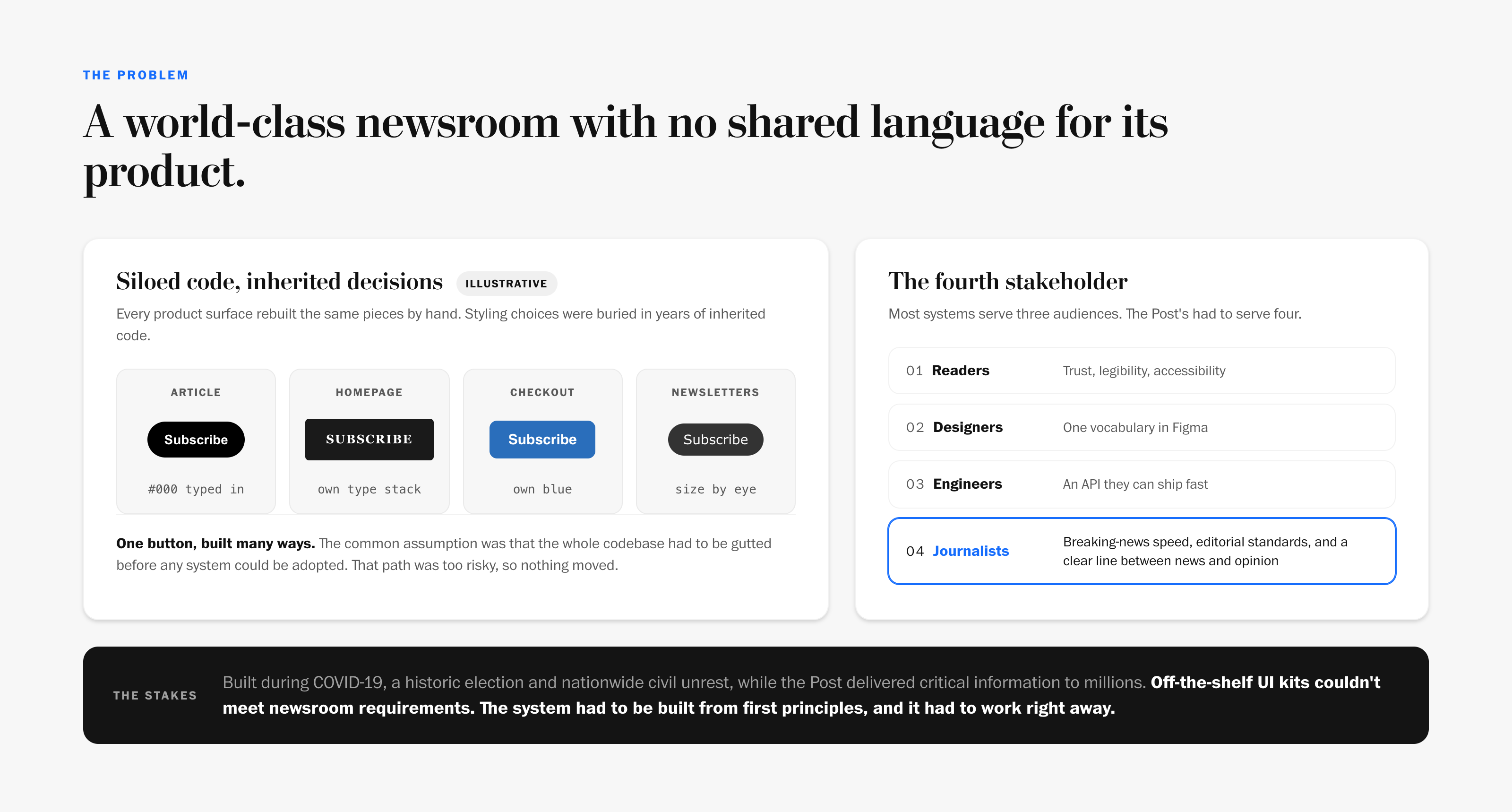
When I joined The Washington Post, there was no design system. The products behind one of the most influential newsrooms in the world ran on a siloed legacy codebase. Components were duplicated across teams, styling decisions were buried in years of inherited code, and design and engineering had no shared language.
The same button existed many times over, each one rebuilt by a different team. They were all close, and none of them were the same.
 Inspect Detail
The stakes were not theoretical. WPDS was built during COVID-19, an extraordinary political climate and widespread civil unrest. The Post was delivering critical information to millions of people. The system had to work, and it had to work now.
There was a fourth stakeholder. Most design systems serve three audiences: designers, engineers and end users. At The Post there was a fourth: journalists. They have exacting editorial standards, speed-to-publish requirements for breaking news and zero tolerance for anything that blurs how news is presented. Off-the-shelf UI kits couldn't serve them.
Legacy at scale. The prevailing assumption was that the codebase had to be gutted before any system could be adopted. That path was high-risk and expensive, and it kept the organization stuck.
What if the system we need is already in the code, just not written down?
The Bet
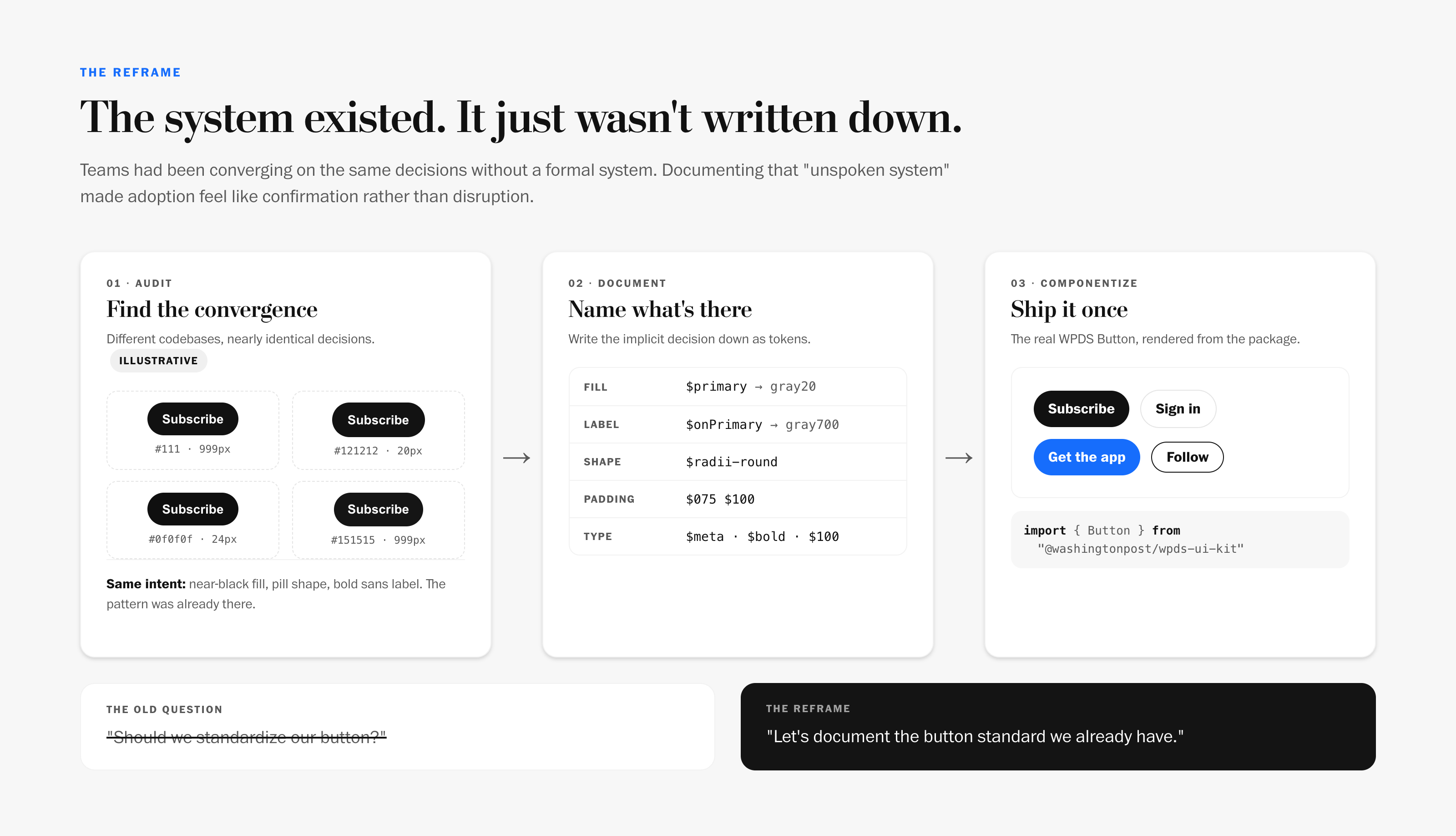
Instead of designing a new system and asking every team to migrate to it, document the system teams were already using and turn it into shared infrastructure.
Let's document the button standard we already have.
Four decisions held it together:
- Document before you design. Start from the patterns teams had already converged on, so adoption feels like confirmation, not disruption.
- Components ask for a role, never a color. Every color resolves through a semantic token, so themes and contexts never touch component code.
- Editorial meaning belongs in the tokens. News and opinion are a system-level distinction, not a per-team styling choice.
- One source, every surface. Tokens are authored once and feed code, Figma and documentation from the same file.
Process
Finding the unspoken system
 Inspect Detail
Rather than forcing a top-down overhaul, I looked for what was hiding in the chaos. Even without a formal system, teams had been designing and coding toward the same decisions: similar spacing, repeated color usage, shared layout instincts. There was an unspoken system in the work. It just wasn't documented or operationalized.
That changed the strategy. Documentation led to componentization, and componentization made alignment frictionless. Parts of pages that couldn't adopt a shared button before suddenly could, because the shared button no longer looked out of place next to what they already had.
It also changed the technical risk. Instead of rewriting the repository, teams could migrate onto the system incrementally.
Components ask for a role, never a color
 Inspect Detail
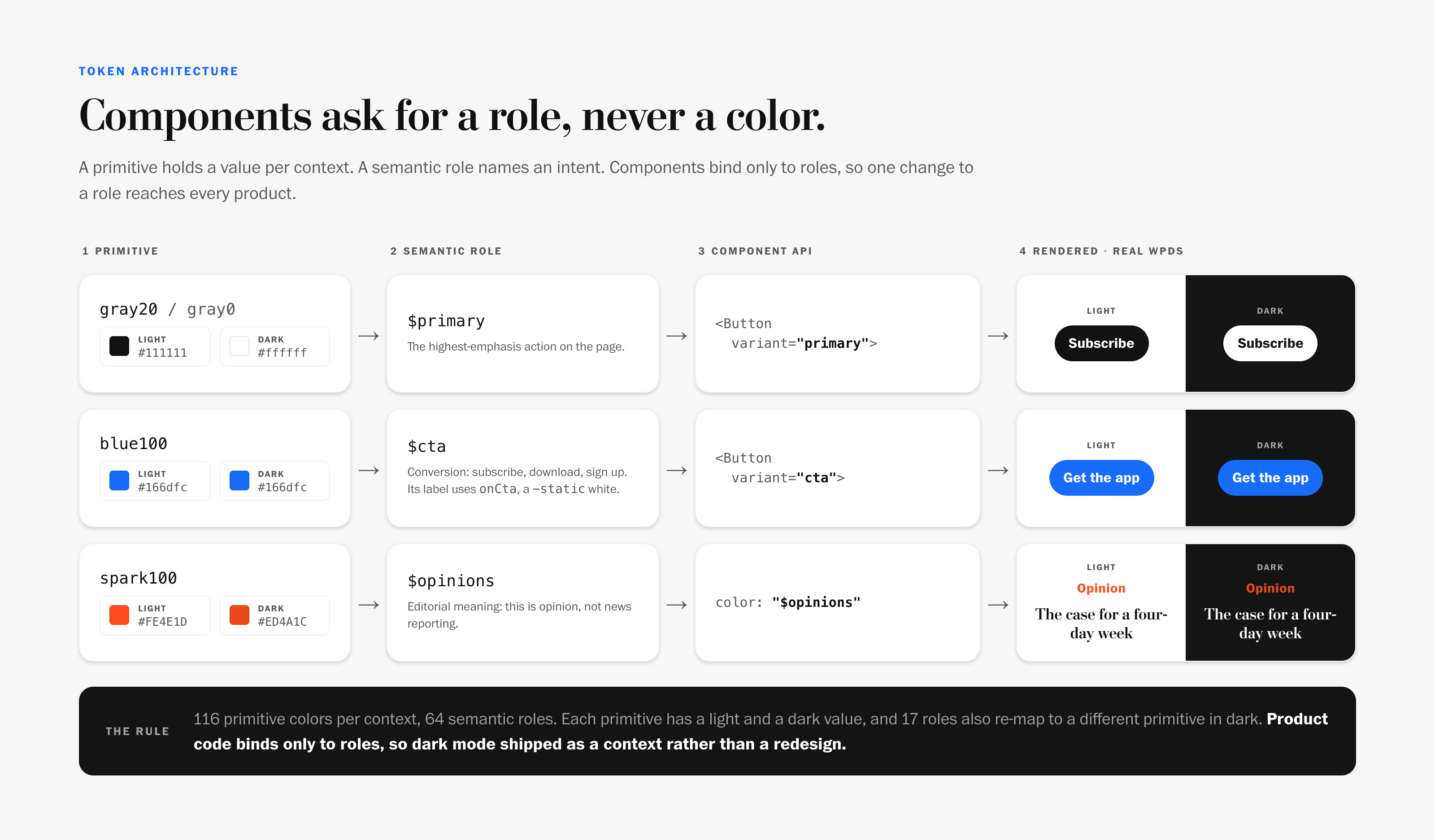
The token architecture has two tiers. Primitives hold raw values for each context: 116 colors in light and 116 in dark. Semantic roles name an intent. There are 64 of them, such as primary, surface, cta and opinions.
Components bind only to roles. The Button asks for $primary and $onPrimary, not black and white. Each role can also re-point to a different primitive in dark mode, and 17 of them do. That one rule is what later made dark mode a context switch instead of a redesign.
Key decision: opinions in the tokens
 Inspect Detail
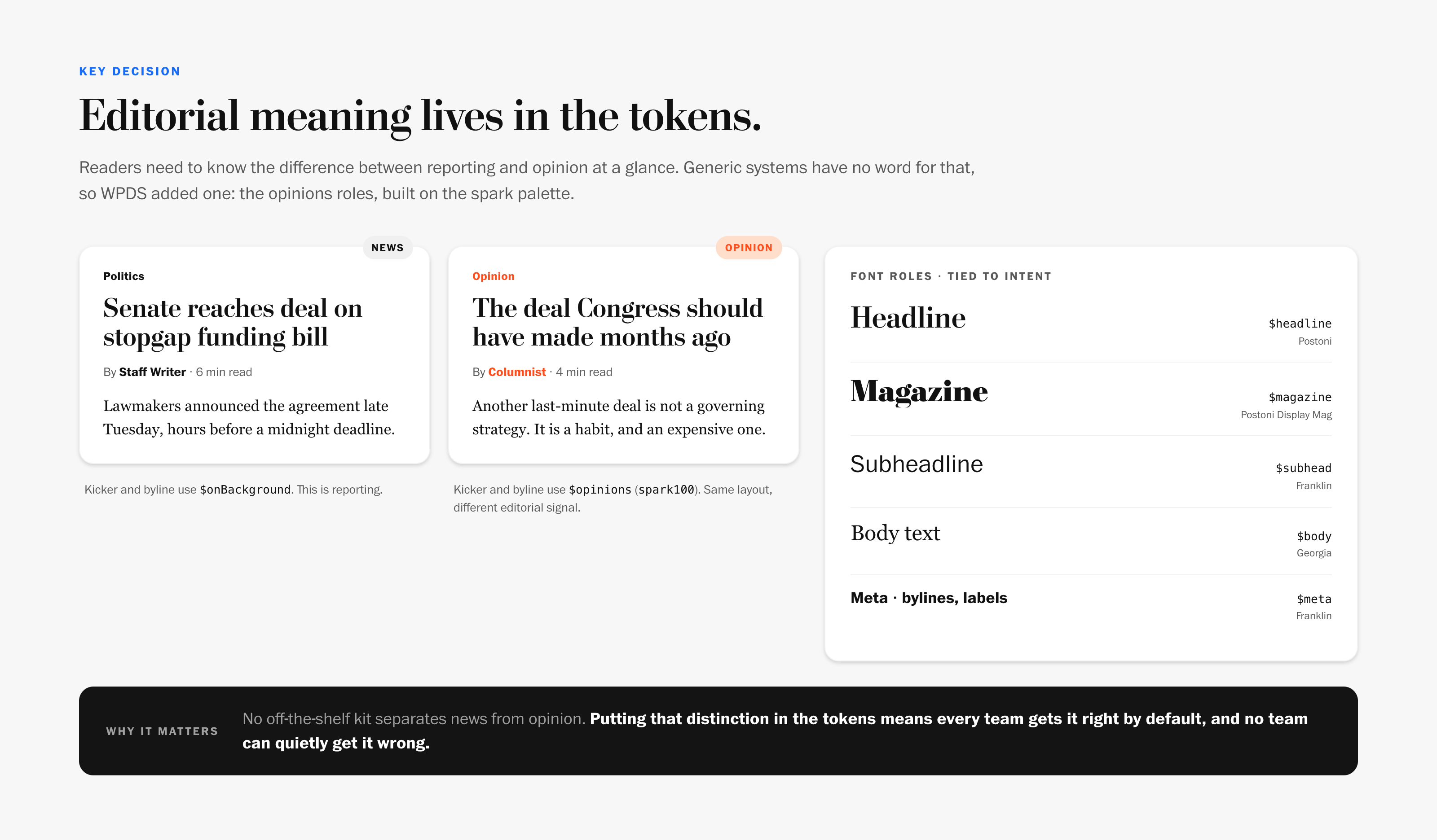
Readers need to tell reporting from opinion at a glance. Generic design systems have no word for that, so WPDS added one: the opinions roles, built on the spark palette.
Putting that distinction in the tokens means every team gets it right by default, and no team can quietly get it wrong. Typography follows the same logic. Postoni carries headlines, Franklin carries subheads and bylines, Georgia carries body text, and each is a named role rather than a font choice.
Not every color should flip with the theme, either. Static tokens hold the same value in every context, for brand marks and text on photography.
One source, every surface
 Inspect Detail
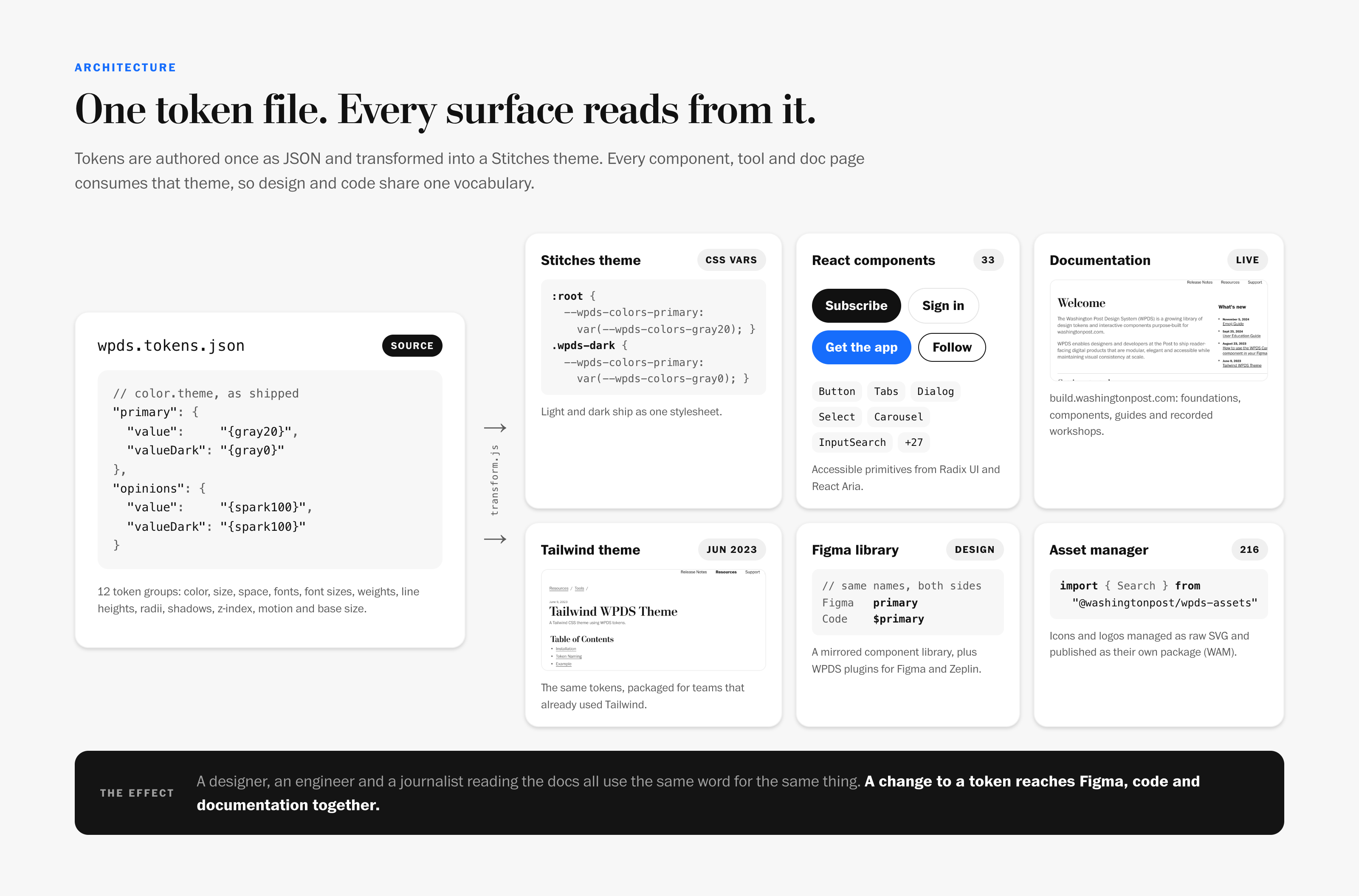
Tokens are authored once as JSON and transformed into a Stitches theme. Everything else reads from that theme:
- React components built on Radix UI and React Aria primitives, so accessibility comes from the foundation, not from each team.
- A Figma library that mirrors the components and uses the same names, so design and code share one vocabulary.
- A Tailwind theme (June 2023) for teams that already used Tailwind, with the same tokens.
- An asset manager that publishes icons and logos as their own package.
A change to a token reaches Figma, code and documentation together.
How components got made: the component sprint
Early on, components shipped one of two ways. Some were design-led, like select, radio and checkbox. Others were developer-led because they were technically harder, like carousel and input search. Both caused delays and late compromises. Developers ended up flagging limitations after the design was set, and designers found their use cases missing from what shipped.
So we replaced that closed, linear handoff with a component sprint: a roughly 10-day process, run for every new component, led by a designer-developer pair from start to finish.
- Prioritize. A weekly 30-minute review scores candidate components by impact versus effort, using feedback stakeholders leave on each ticket.
- Concept. A two-hour FigJam kickoff with the wider team sets goals, requirements and scope before anyone touches visual design.
- Discover. Everyone drops in references, code and screenshots, sorted into a shared toolbox: API, behavior, accessibility, animation, variants, considerations and requirements. That's how the "dropdown" became an action menu. The team realized it was for commands, not navigation, which another component already handled.
- Build as a pair. The designer and developer work in parallel and check in often. Constraints shape the concept and the design shapes the implementation.
- Ship together, with docs. Every component lands in the Figma library and the code package at the same time, with preliminary documentation that records the decisions behind it.
Both the developer and designer understand their work is malleable: it can be reworked, or even discarded, and no one is the villain for suggesting a change.
The sprint cut the time to deliver a new component from about six weeks to about 10 days. Victor Alejandro Aguilar and I wrote it up as The Anatomy of a Component Sprint for the Figma blog (April 2024), with a FigJam template so other teams could run their own. Figma told us it was one of its most successful posts, and leading design systems practitioners shared it widely.
The doc site as the source of truth
 Inspect Detail
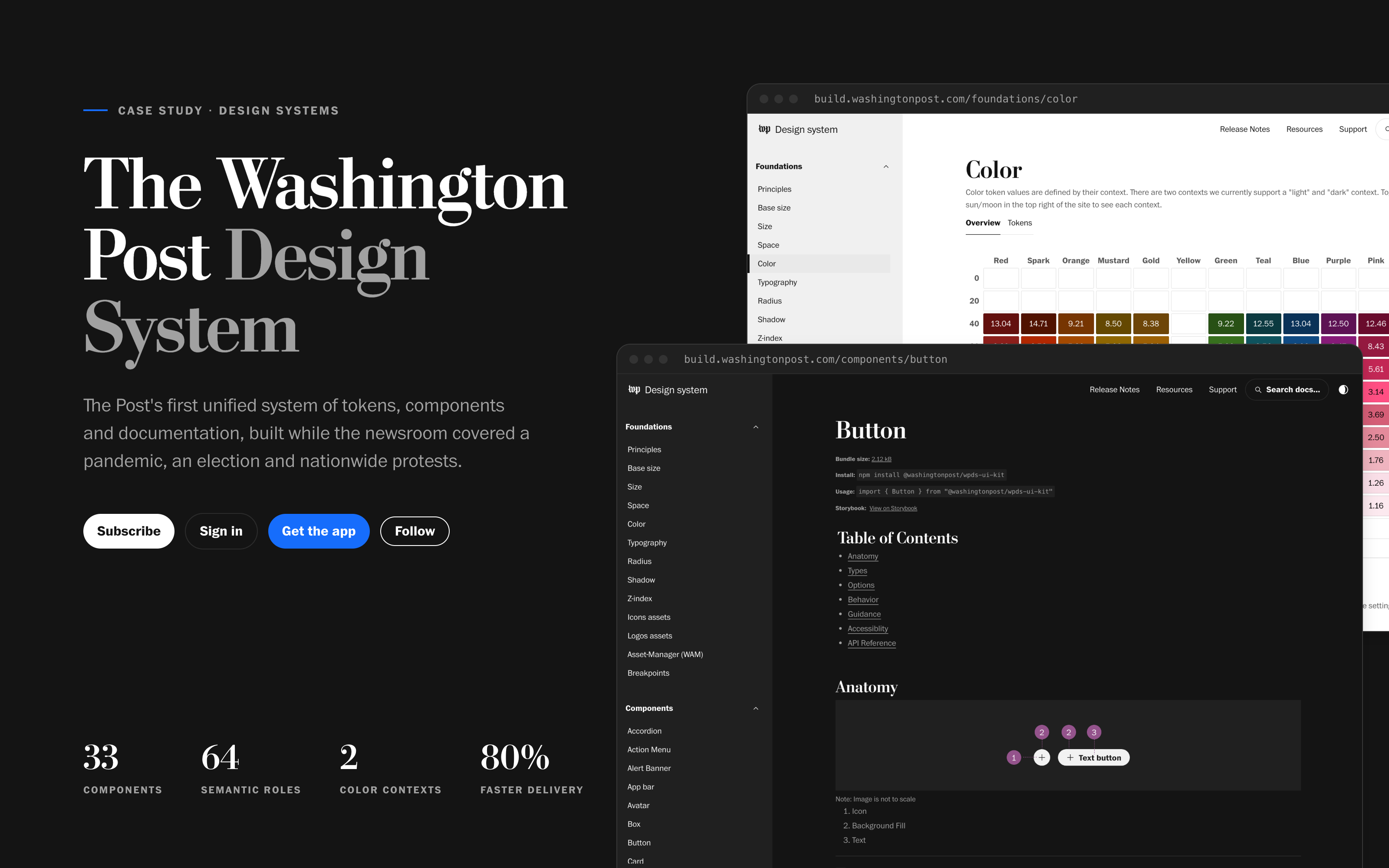
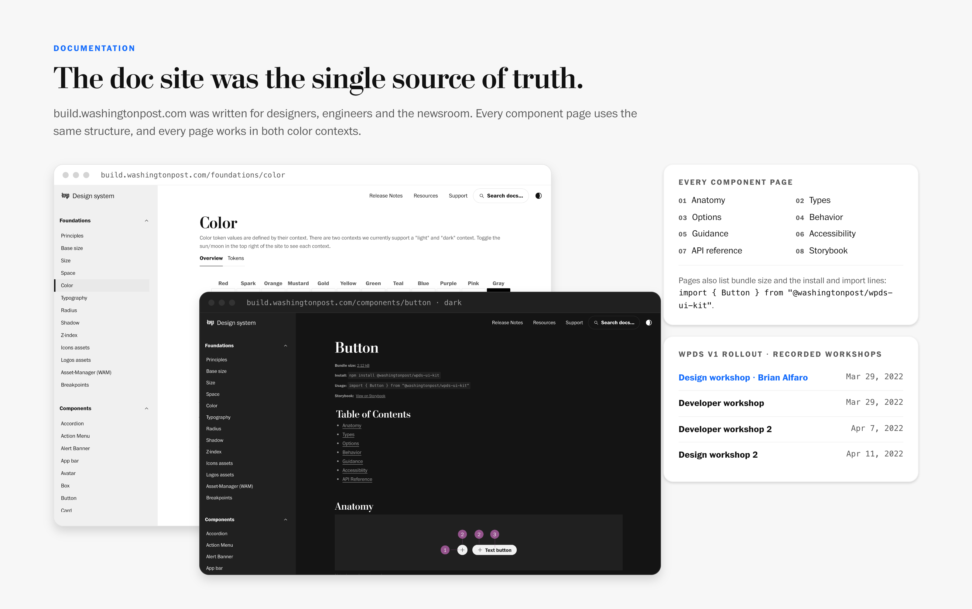
build.washingtonpost.com was written for designers, engineers and the newsroom at once. Every component page follows the same structure: anatomy, types, options, behavior, guidance, accessibility, API reference and a Storybook link, plus the bundle size and the exact install and import lines.
The site was built with the system, so it works in both color contexts. It became the place where tokens, components, usage patterns and editorial guidance lived together.
Dark mode was a re-point, not a rebuild
 Inspect Detail
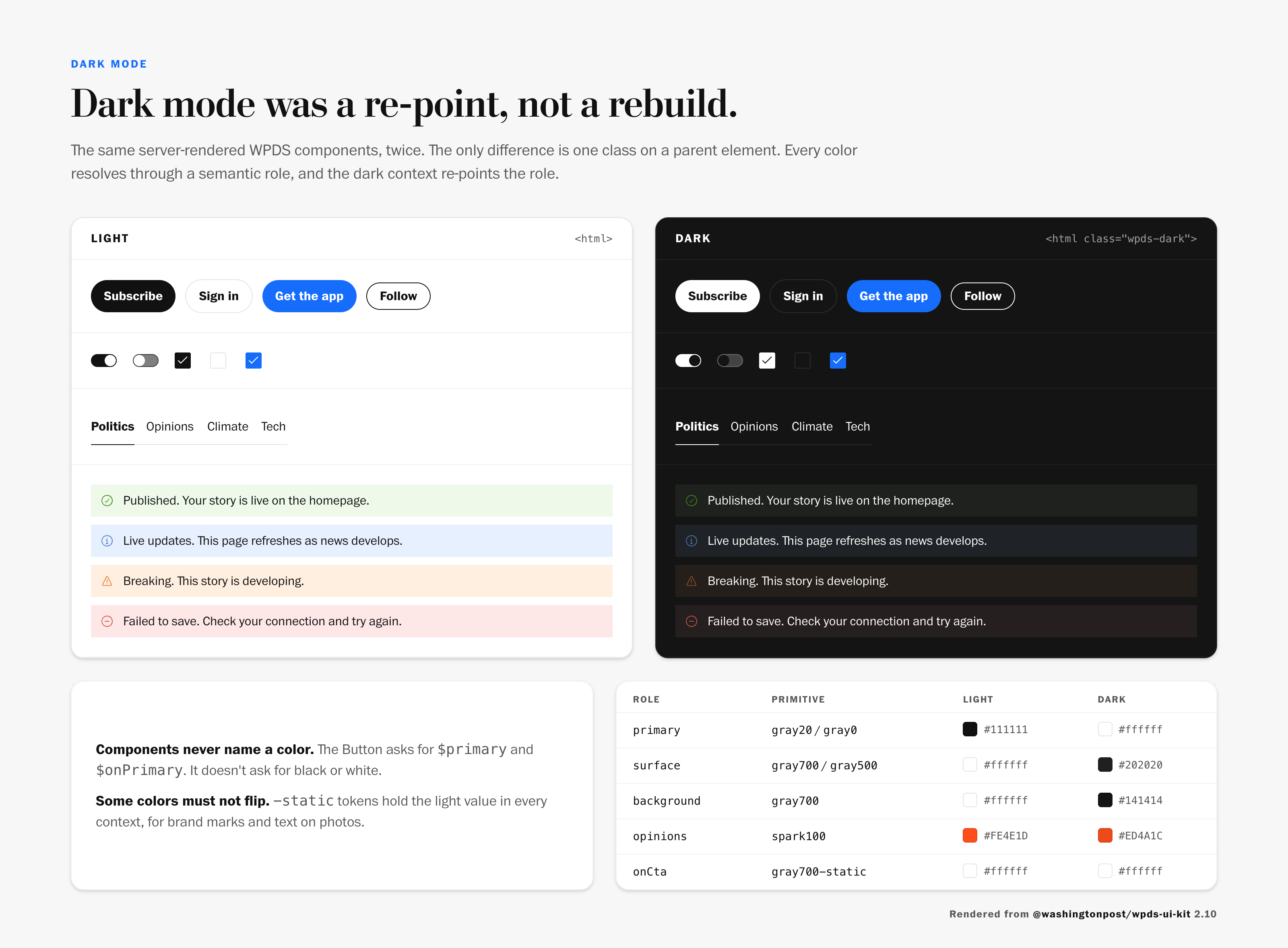
Because product code only ever asked for roles, dark mode didn't need new components. Light and dark ship as one stylesheet, and a single wpds-dark class switches the context. Each role resolves to its dark value, and everything built on the system follows.
Adoption Is the Real Test
A design system only matters once teams use it. Because WPDS documented patterns teams already recognized, adoption didn't require a rewrite. Teams moved onto the system one surface at a time.
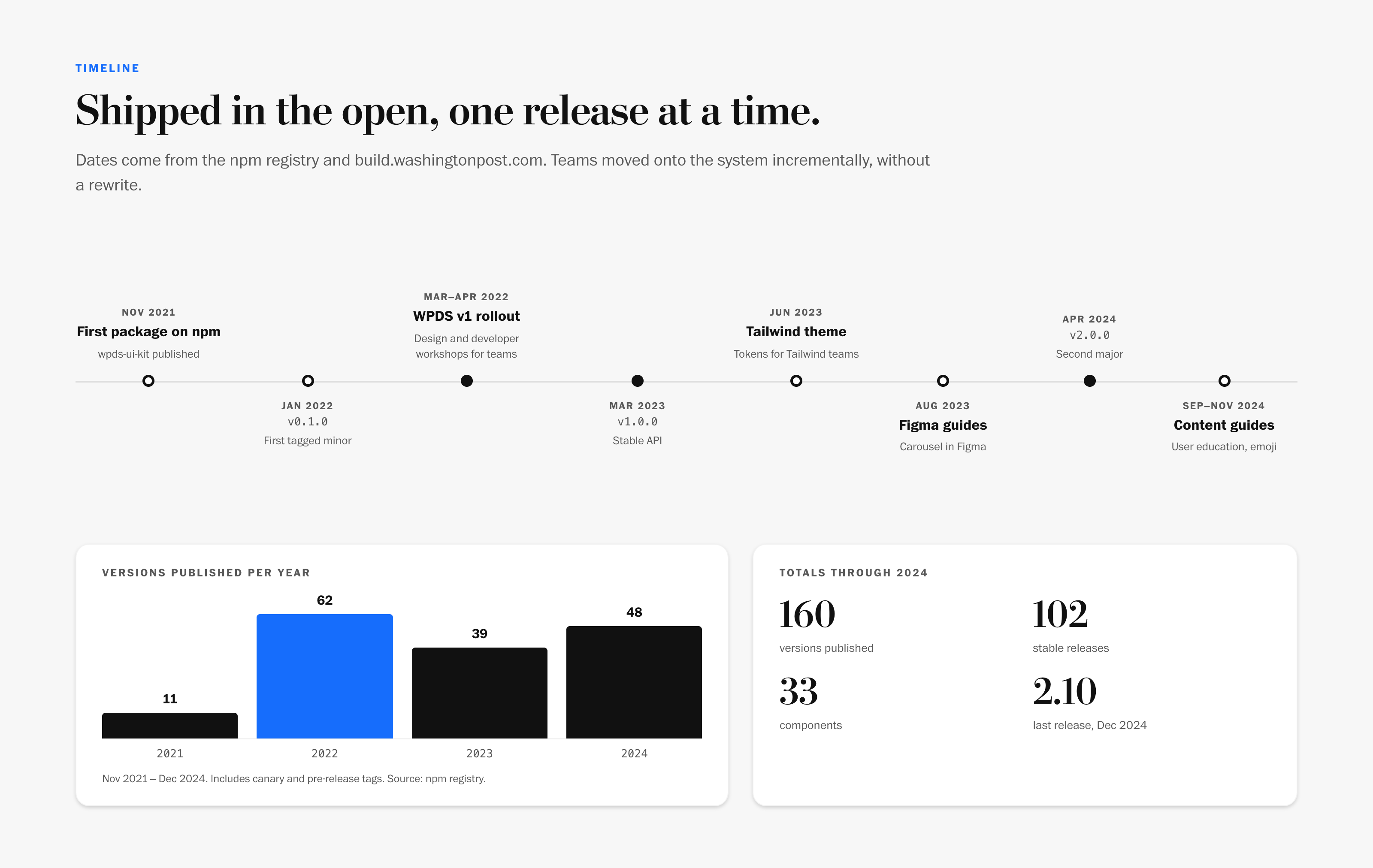
The v1 rollout was taught, not just announced. In March and April 2022 we ran recorded workshops for both disciplines. I led the design workshop, and the developer workshops walked engineers through installing and building with the kit. The recordings stayed on the doc site, so new teams could onboard without waiting for the next session.
The system then kept shipping in the open: a stable 1.0 in March 2023, Figma guides and the Tailwind theme that summer, a second major version in April 2024, and content guides for user education and emoji later that year.
Impact
 Inspect Detail
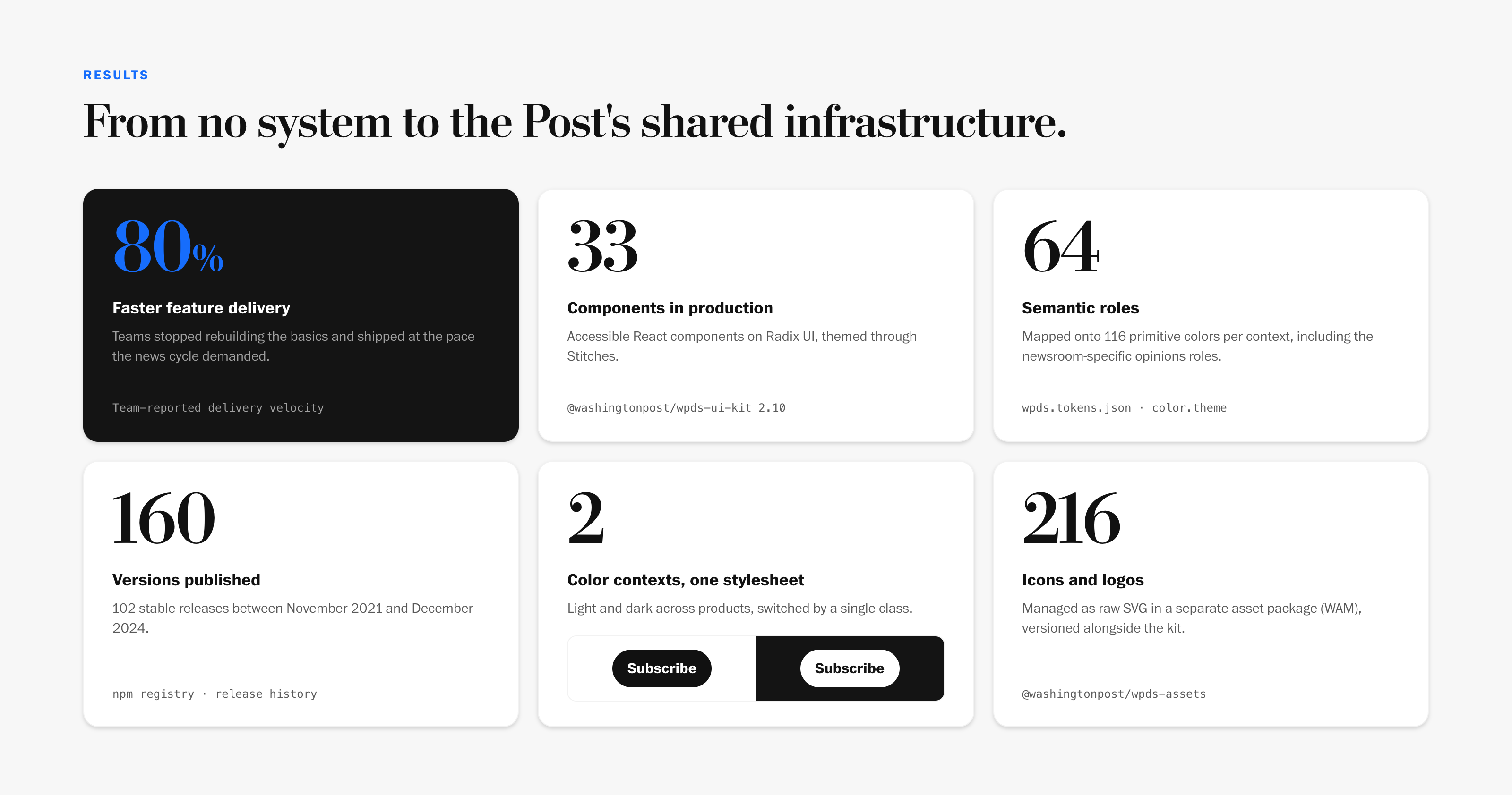
| Before | After | |
|---|---|---|
| Shared system | None. Each team rebuilt the basics | 33 components and one token file shared across products |
| Color | Hex values in each codebase | 64 semantic roles over 116 primitives per context |
| Design and code | Separate vocabularies | One set of names in Figma, code and docs |
| Editorial meaning | Styled by each team | News and opinion encoded as tokens |
| Dark mode | A rebuild | A context, switched by one class |
| Documentation | Tribal knowledge | build.washingtonpost.com, for designers, engineers and the newsroom |
| New component delivery | About 6 weeks, design-led or dev-led | About 10 days, through a paired component sprint |
| Delivery velocity | Baseline | 80% faster time-to-ship for new features |
 Inspect Detail
Beyond the numbers, WPDS changed how The Post collaborates. Editorial, product and engineering share a common language. New products start from the system instead of from scratch. Design Operations became a discipline at The Post, and the system grew to support dark mode, accessibility and cross-platform work.
Reflection
Don't start from zero. The most important decision was resisting the instinct to start over. Mapping the patterns teams already had, instead of imposing new ones, is what unlocked adoption. It turned a multi-year overhaul into an incremental rollout.
Build the doc site first. If I did this again, I'd invest in the documentation site even earlier. It became the single source of truth that held everything together, and the sooner it exists, the sooner alignment compounds.
Put the domain in the tokens. The opinions roles were small, but they carried the most meaning. A design system for a newsroom has to encode what makes a newsroom different, or every team will re-solve it on its own.
Infrastructure work is organizational. Building a system for a newsroom during the most intense news cycle in a generation taught me that the hard part isn't technical. The system had to serve journalists as much as engineers, which meant designing for trust, speed and editorial integrity at every layer.
Every figure in this case study is rendered from the real @washingtonpost/wpds-ui-kit components and tokens. Screenshots are from build.washingtonpost.com.
Built with the WPDS team at The Washington Post, including Arturo Silva, who led the developer workshops, and Victor Alejandro Aguilar, who co-wrote the component sprint article with me.